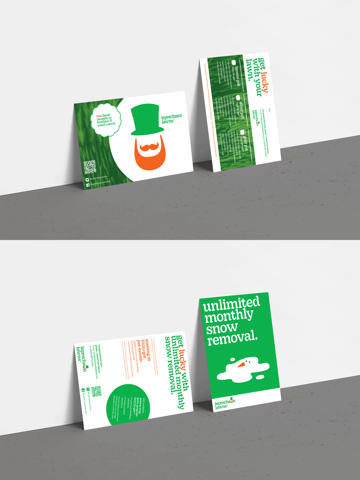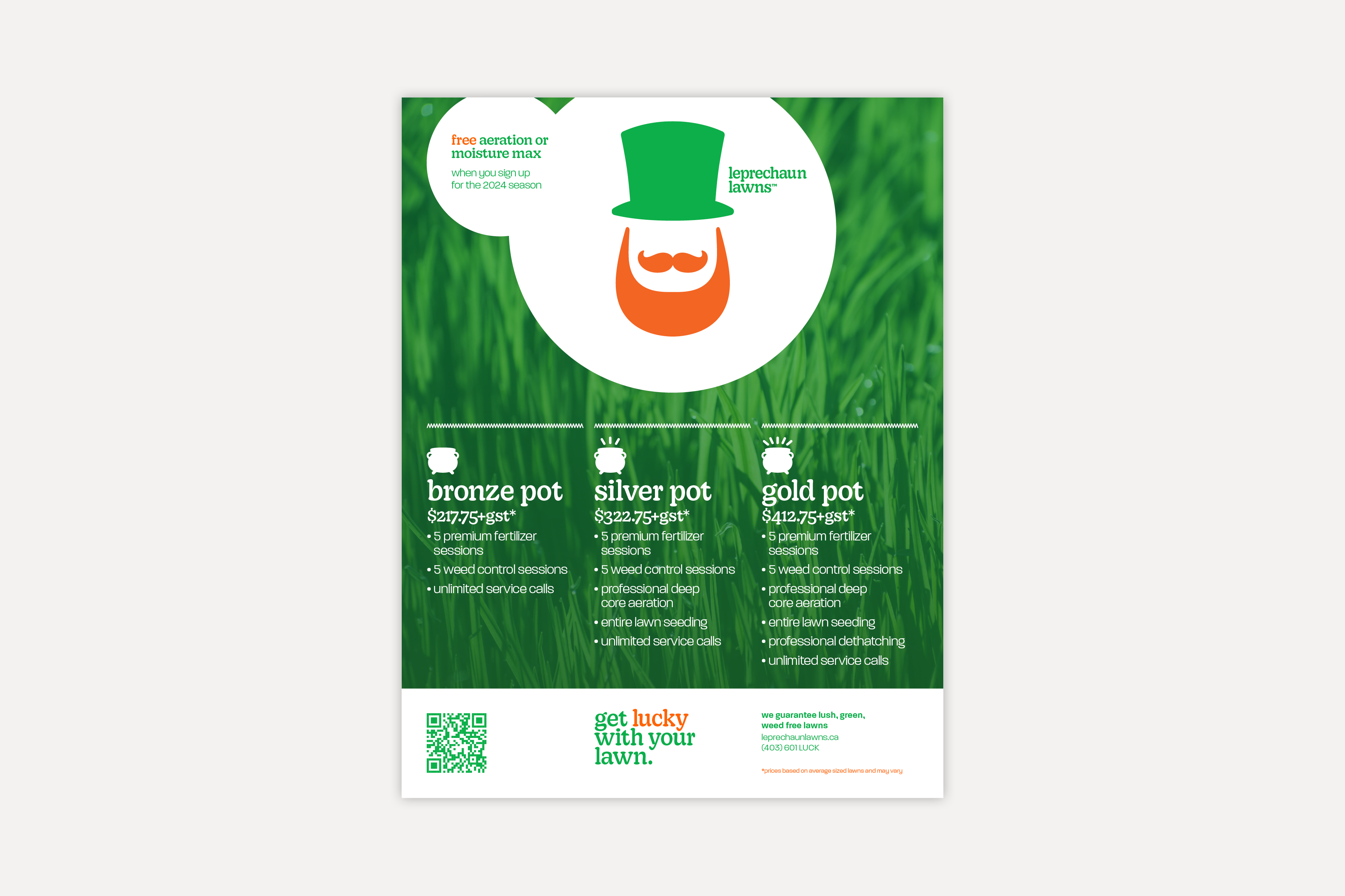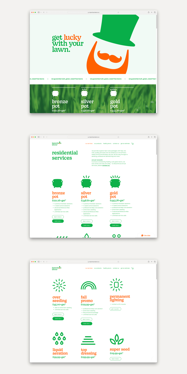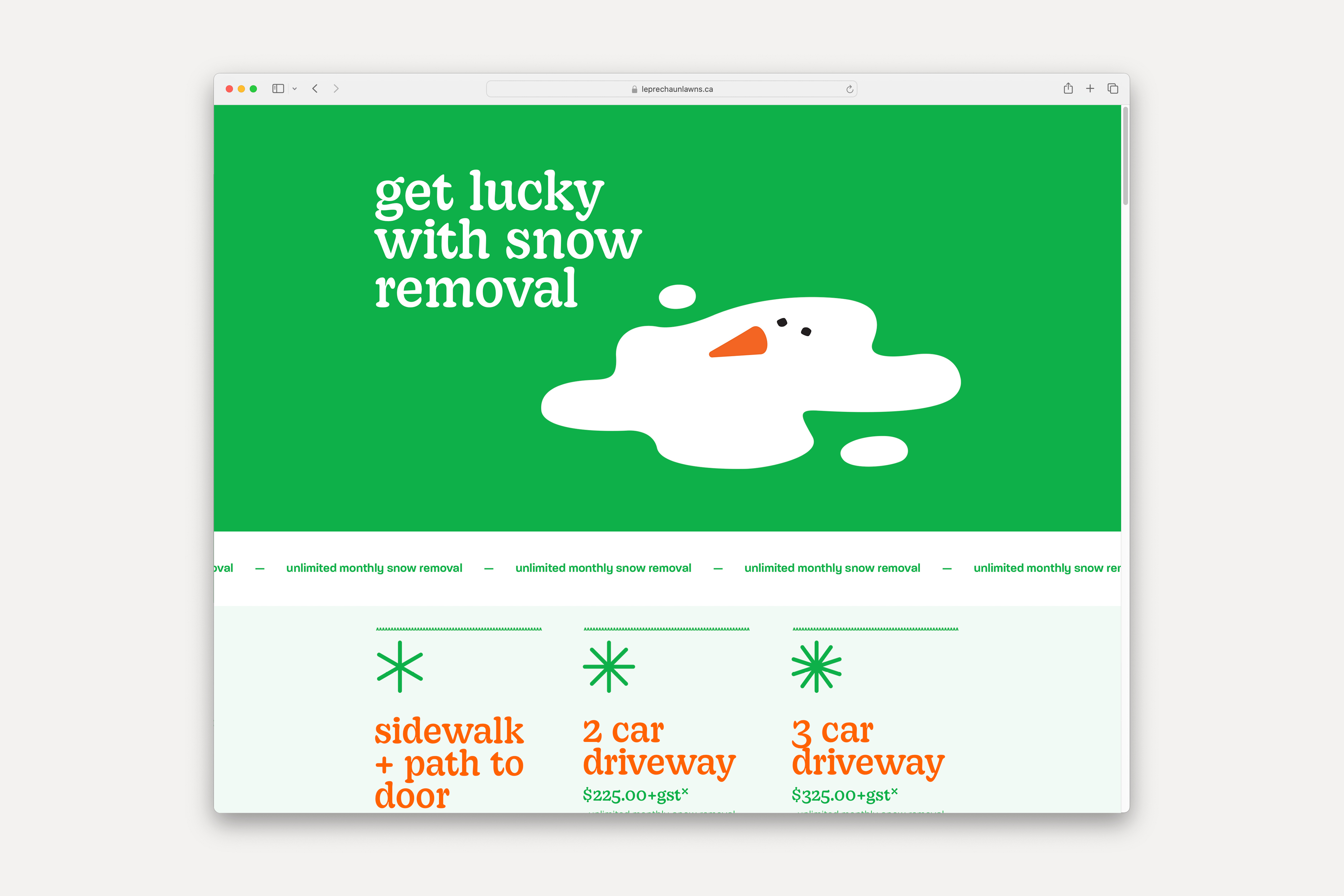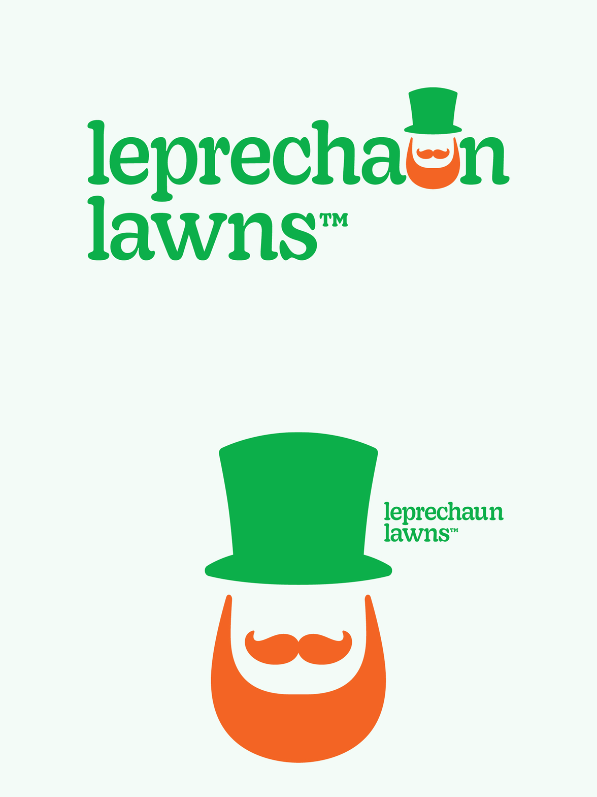

As an emerging lawn care business, Leprechaun Lawns needed a brand identity that encompassed both the whimsy and trust that the Leprechaun Lawns team channels. For &then, this meant using approachable typography, a refined and bold colour palette, and associative graphics to the Leprechaun persona. A pillar to the brand is the strong, overly simplified character that not only captures the attitude of the business but serves as a key component of the logo. It was so well received that kids in Calgary send the lawn care business drawings of the leprechaun often. Green lawns, good luck, and a jolly attitude that the brand carries is
at the forefront of the brand expression that we created.
Logo /
Colour palette /
Typography /
Iconography /
Website design /
Website development /
Vehicle livery /
Print assets /
Seasonal Campaigns /

